
8 Tips to Better Architecture Diagrams
A good architecture diagram (aka a cloud architecture diagram or system architecture diagram) gives a great overview of your project. It lets you see at a glance what the overall structure of the solution is. This is useful for gaining an understanding of how the system fits together, how it flows, and what it does. It also helps to easily show which components can be improved, are due to be updated or could be better components (or improved architectural guidelines).
The architecture diagram is part of the 7 crucial documents you need for your project, see our rule: Do you make awesome documentation?
When is it useful to have an architecture diagram?
Most developers find an architecture diagram is useful:
- In the initial discussion with a client (see Brendan Richards’ quote below)
- When you are onboarding a new developer
- After you have been deep into one aspect of the system and need a refresher on another area
- If you have been off the project for a while
- Whenever you are discussing requirements that may require structural changes
An architecture diagram is great ~ it’s a nice and easy way to onboard developers and I’m a fan of including it in my proposals to clients
– Patrick Zhao, Senior Software Architect
When should you use it?
An architecture diagram is a technical diagram that demonstrates the technology in use. The purpose of the architecture diagram is to show how a solution has been built and what the technical dependencies are. It is not used for user journeys or business logic.
Depending on the complexity of your solution and your comfort/familiarity with the tools, an architecture diagram could take you anywhere from half an hour to a couple of days.
Usually, the longer an architecture diagram takes you to make, the more important it is for your project.
– Matt Goldman, Software Architect
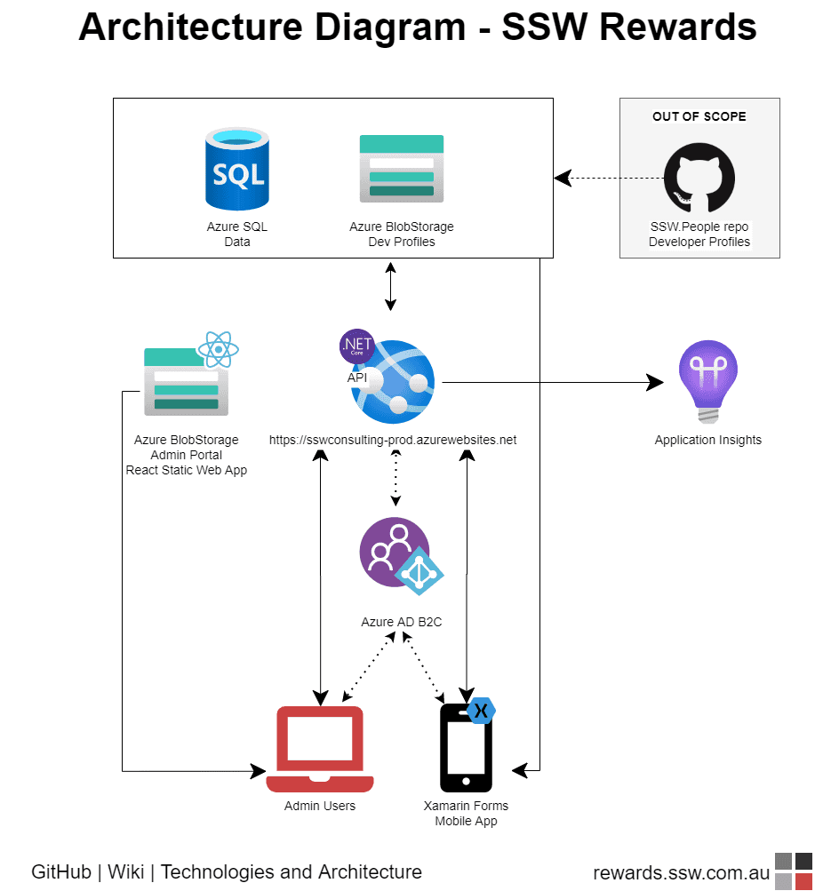
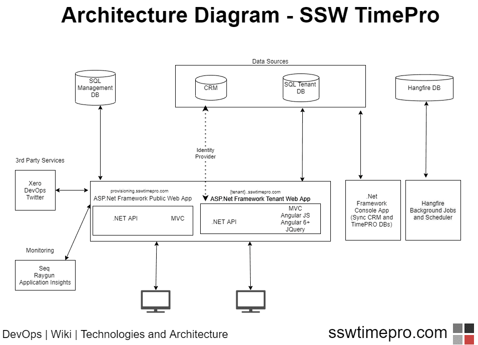
Tip 1: Include your most important components
At a minimum, your architecture diagram should include:
- Your data repository
- The business logic component
- Your UI
The diagram needs to include the relationships between these components, and how they share and process data.
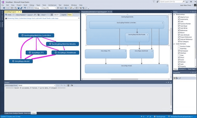
Tip 2: Don’t use a .NET Dependency Graph as a System Architecture Diagram
The .NET dependency diagram is a useful tool, but it drills down into a specific component of the solution (the code) while ignoring the rest of it (the infrastructure). If it adds value to your documentation (i.e., there is a specific reason to include it) you can include the .NET dependency diagram, but don’t use it here in place of the architecture diagram.
See SSW rule: Do you generate the VS Dependency Graph?
Tip 3: Show data dependencies and data flows
Your architecture diagram should show how the components of your solution fit together. It should also show *how* the components of the architecture depend on each other for functionality, as well as upstream and downstream data dependencies.
Tip 4: Put data at the top
It should be easy to tell at a glance which direction data flows in your diagram: left to right, right to left, top to bottom (recommended). Pick a direction for your data flow, and keep it consistent across all your documentation. Where there are exceptions (for example data going to analytics or to/from partner sources) make these perpendicular to the primary data flow direction.

Tip 5: Group relevant components
Group components logically by enclosing them in a box. Components that operate independently can stand alone, and those that work together to deliver a logical function can be grouped together. Also show components that are out of scope, i.e. important for understanding the architecture, but not necessarily part of it, e.g. legacy components, partner components, or components that have not been implemented yet.
Note: for clarity, out of scope items whether one or many, should be in a box.
Tip 6: Start with paper… or a white board
Make sure you use the right tools when creating your architecture diagrams. There’s nothing wrong with starting out with pen and paper, but your hand-drawn sketch should not be considered your ‘done’ final architecture diagram. If you want to save paper, and increase collaboration, a great alternate is the trusty old Whiteboard.
For me its all about building a shared understanding between the client and the developers. Most pieces of software architecture I do, work starts by building a rough solution architecture diagram on a whiteboard.
Putting something on a whiteboard is “low risk” for the participants as its really easy to wipe and redraw. It allows us to start working together straight away, building a shared understanding of what we’re trying to achieve. There is no software or skills required to participate in whiteboard collaboration.
A key milestone in the early engagement is the first time a client takes the pen and starts using the whiteboard to explain something to me. Early use of the whiteboard is all about immediate communication. Later, the solution design starts to solidify and we can then use the last state of the whiteboard to make out first architecture diagram.
– Brendan Richards, SSW Solution Architect

Tip: Microsoft Office Lens is a free mobile app that uses your phone’s camera to capture scan-like images of documents, photographs, business cards, and whiteboards (including searchable handwritten text).

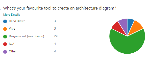
Tip 7: …and Finish up with Diagrams.net
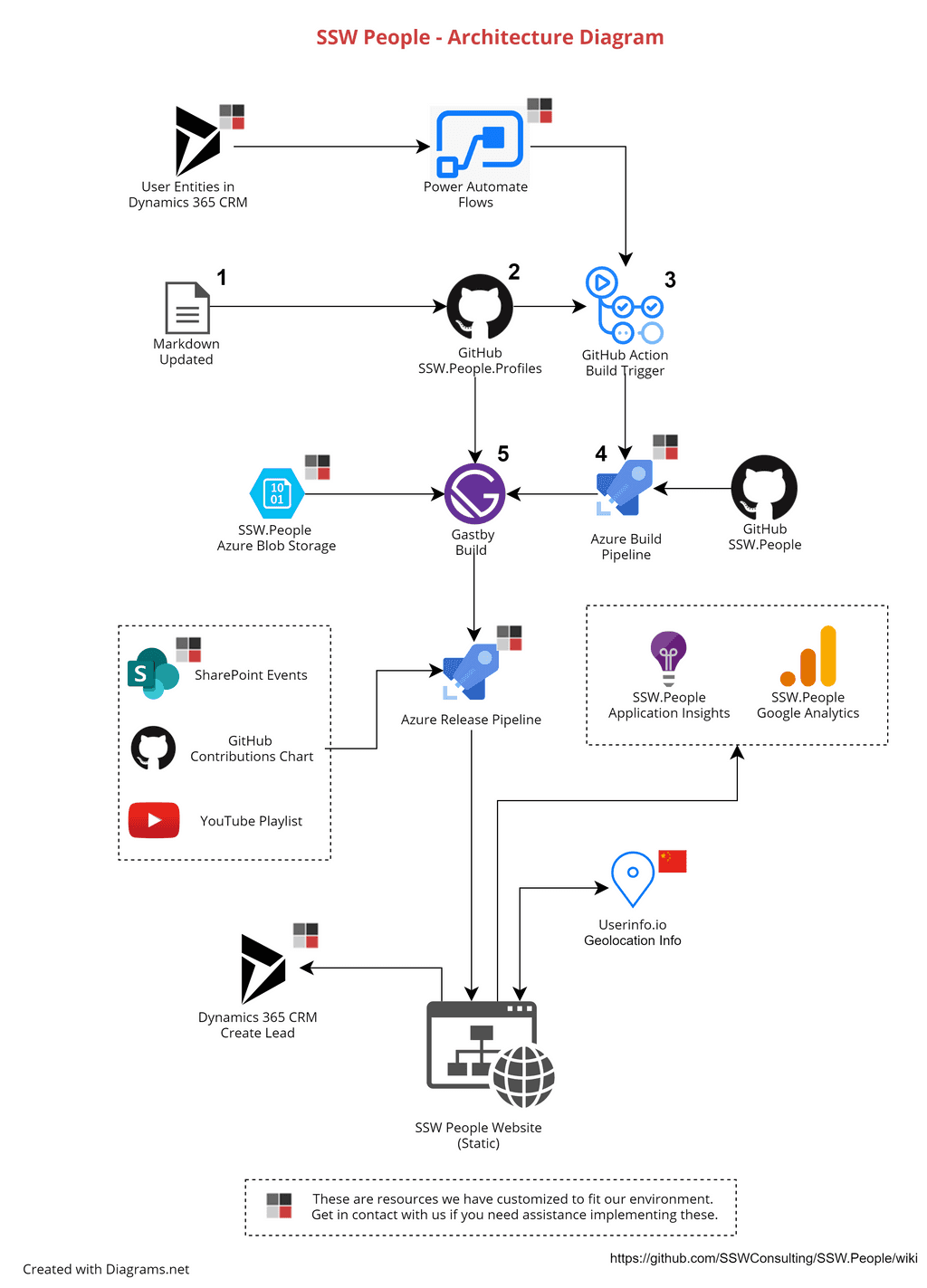
The best tool for creating these diagrams is diagrams.net (although I still prefer their old name, draw.io). All the examples on this page were created using this tool.
It is definitely the most popular diagram tool at SSW:
Diagrams.net is free, can be used in the browser, or can be downloaded as a desktop app. But the best way to use diagrams.net is to integrate it directly into VS Code.
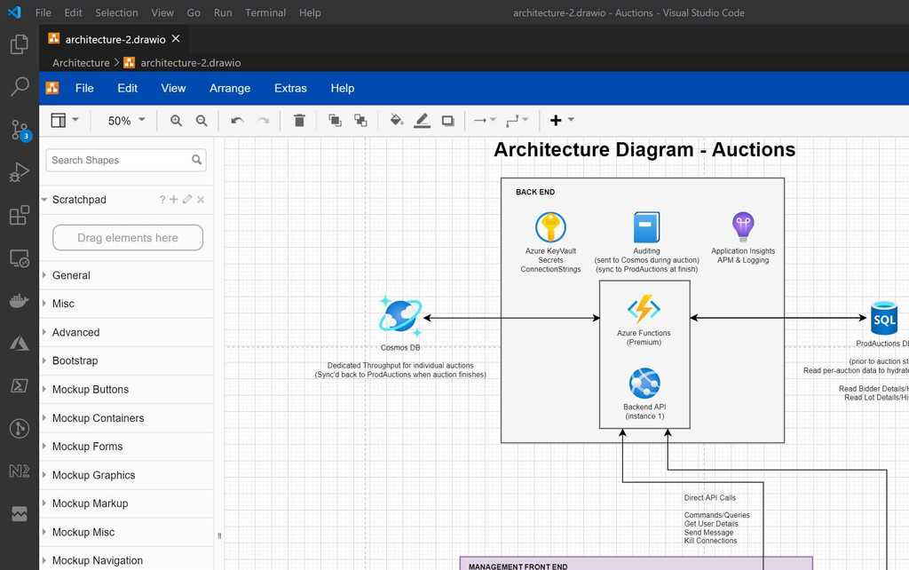
There are multiple extensions available that let you do this, the best one is VS Code | Extensions | Draw.io Integration. This makes it easy to create and edit the architecture diagram right alongside the code, and check-in with the relevant commits.
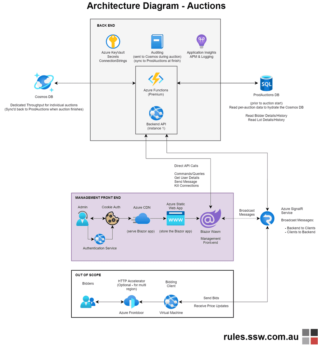
Tip 8: Polish up Diagrams.net
Maintain standards to keep your diagrams consistent:
- Diagram heading: Naming convention of “Architecture Diagram – [product name]”, in font size 43pts
- Use a standard font: e.g., at SSW we use Helvetica bold
- Arrowhead sizes: 14pts
- Bottom left – add location: e.g., DevOps | Wiki or GitHub | Repo | Docs, in font size 22pts
- Bottom right – add branding and URL, in font size 22pts
- Add color and icons to make your diagrams engaging and easier to distinguish
Conclusion
There are so many easy ways to create a great, visual and technical drawing, whether it be on a whiteboard or paper, or through using a great diagram tool like Diagrams.net. Architecture diagrams allow developers to onboard faster and can give technical and non-technical people alike a better understanding of the infrastructure, with one glance.
Hopefully I have convinced you on the usefulness of architecture diagrams, whether starting your next project, or doing handover on an old one. Let me know your thoughts, will you be giving Diagrams.net a go?
Related Rule
Do you have an Architecture Diagram?
October 13, 2020 @ 12:33 AM
I think C4 Models cover most of all mix of diagrams you talk about. For a long time, we at our company tried to document in a common language these diagrams, and always we found that every architect has different perceptions about the required level of detail until we discovered the C4 models. It is just a comment.
January 1, 2021 @ 6:54 PM
Thank you!!1
September 2, 2022 @ 2:57 AM
image links on this article seem to be broken 🙁
September 6, 2022 @ 9:08 AM
Hi JM – they are all working now! 🙂
January 28, 2024 @ 10:59 PM
Hi Excellent work putting this together! I question what AI will do in this area over the next five years.