SSW 1996 to 2026 – A Fun 30 Year Website Journey
Last month, I posted about SSW’s homepage receiving a 2026 facelift! Looking back, this website has a long history of over 30 years. I thought it would be fun to share a few of the old homepages.
Let’s take a trip back in time! I know, I know, some of them have aged better than others. 😂 😂
The first SSW website was built in a very different world. Visitors were using dial-up connections, often at just 28.8 or 33.6 kbps, on small desktop monitors. Developers had limited fonts, unreliable browser support, and no modern CSS. Images had to be tiny, layouts were built with HTML tables, and every extra kilobyte mattered. Even with those restrictions, this website helped build SSW…
When new employees turned up to SSW, I wanted everyone to update website content, so they had to learn HTML in their first weeks. It was an aspirational goal at the time, and worked to an extent, but of course it ended up making some people go crazy, and slowed things down.
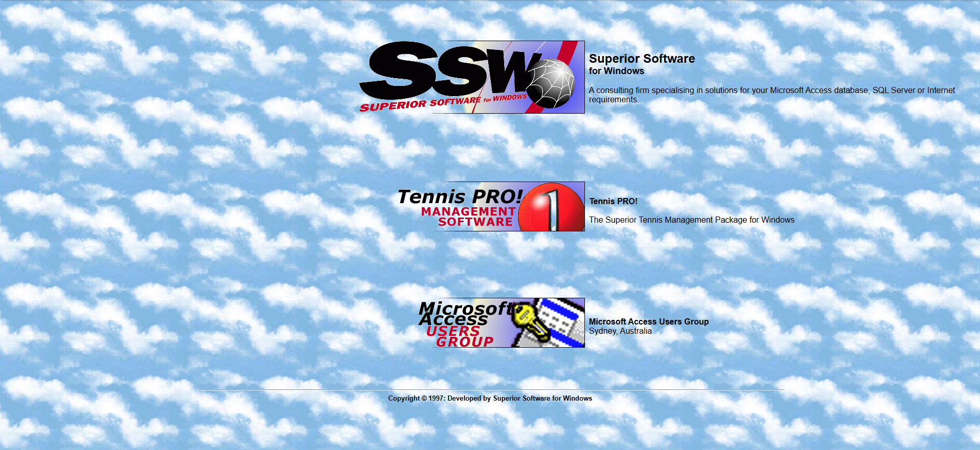
SSW 1996
Here’s the OG webpage from 1996!! Today’s SSW Designers would not recognise our brand. At the time, I wanted to be associated with Windows 95, hence the clouds. It was a very exciting time.
It was 100% HTML!
In 1996 we migrated to ASP, which was the original Active Server Pages.
SSW 2001
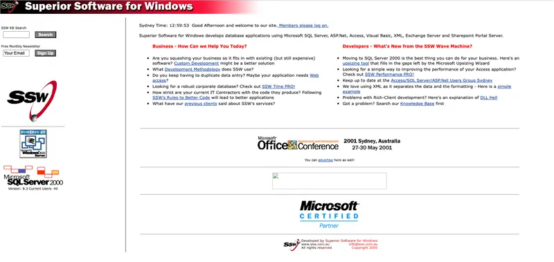
A nice upgrade in 2001… You can see the shift towards the current SSW branding with red becoming our highlight colour. At this point, the designers were the developers.
You can also see the logo was still very much connected to the World Wide Web…
The tech was ASP.NET beta 1.
In 2005, the tech was updated to ASP.NET 2, which introduced caching for performance and master pages.
In 2007, we got rid of SQL stored procs and moved to .NET Entity Framework.
SSW 2009
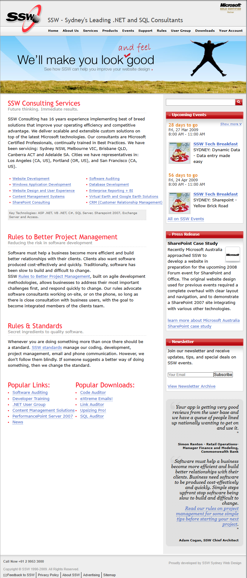
By 2009, the SSW website had become much more visual and structured. We now had a few web designers. Faster internet connections meant we could introduce a large hero image and event thumbnails. The website also became data-driven with the events and a shopping cart. The site also gained clearer navigation, a multi-column layout, search, and a newsletter sign-up.
It was content-heavy by modern standards, but it shows the shift from a simple online brochure to a website designed to promote services and encourage visitors to attend the SSW events we were running.
The tech was now ASP.NET on .NET 3.5.
In 2012, SSW refreshed its branding by introducing square elements inspired by Windows 8’s Metro design language.
SSW 2014
By 2014, the homepage had the new SSW logo, and had become far more visual and conversion-focused. We introduced more video content, as well as more prominent calls to action. The biggest influence from Metro was its larger typography and flatter design style. We also added Microsoft credentials, customer logos, and an interactive office locations widget.
While still using ASP.NET, the user experience (UX) reflected a much more modern era of web design.
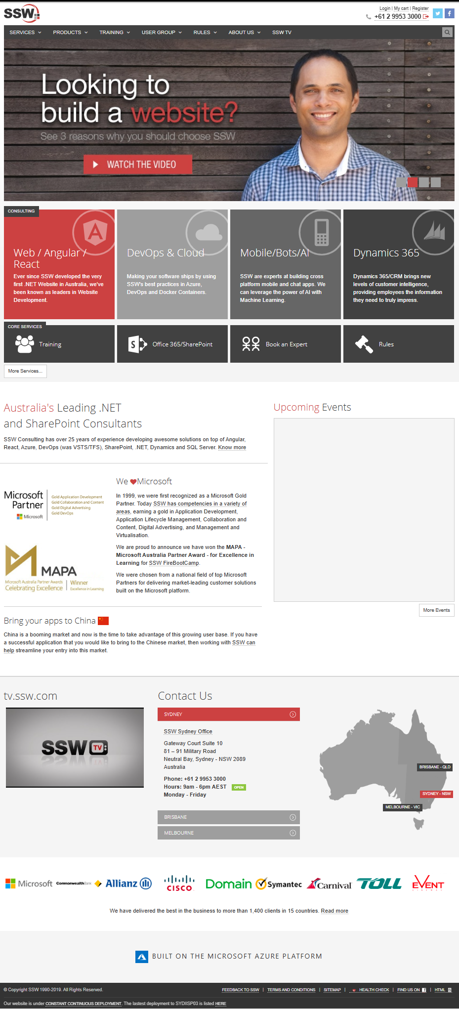
This same design was later rebuilt as a static site (SSG) using Next.js, Markdown for content, and TinaCMS for content editing.
Most new employees already know Markdown (thanks to AI). If they don’t, that’s their first job. This is an easy goal and works well. No one goes crazy and content updates move fast.
SSW 2026 Facelift
We improved the content editing experience in TinaCMS by making the new website block-based. The page became longer with less words. You can read more about this build and why we did it in my last blog: SSW’s homepage receives a 2026 facelift!

Hope you had as much fun remanicing as I did! Let me know in the comments!👇
Thanks to all SSWers that worked on this site over the years, and to web.archive.org