Power BI – No More Guessing
UPDATE 9/02/2017: I’ve added Uly’s Power BI presentation to the bottom of this post.
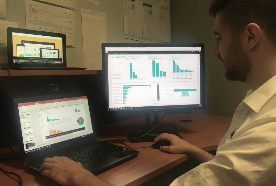
Power BI has significantly changed how I view my company’s data, and the insight I now have into how my business is running is unprecedented. The biggest change has been that the account managers are now in charge of making the reports, rather than the traditional bottleneck of sending changes to developers.
The Bad Old Days of SQL Reporting Services (2004 – 2016)
Let me paint a picture of what pre-Power BI was like at SSW. The best example I can give you is my monthly financial meetings, which go for about 4 hours. I look at a mix of printed and online reports. There are the standard reports like profit and loss, and the balance sheet, but I also dive into opportunities, booked in days, and a whole lot of other reports that are driven from data from our 3 main systems: Microsoft CRM, MYOB, SSWTimepro.com, plus some auxiliary systems, such as Skype for Business (our calls), and VisualStudio.com and GitHub.com (our code).
- During the meetings I had last year, I often find myself banging my head against a wall as I try to get my head around what choices I should be making. My printed out Reporting Services reports show plenty of grids and charts, but there’s always something that is missing.
- It is common that I will pause the meeting and email the developers another round of changes to make next month’s reports clearer. I usually get the report changes done by the next financial meeting, a month later. I know I shouldn’t interrupt the meeting, but I justify it as it’s better to “strike while the iron is hot”.
- Due to the lack of easy insight into my actual data, decisions are too often made based on gut feel, war stories, and guesses. In contentious issues, the loudest or most persistent person generally wins… I hope that doesn’t incentivize some very non-optimal behavior. 🙂
- There’s no easy way to set KPIs, meaning it’s hard to track the success (or lack thereof) of the choices we do make, meaning we’re less effective and not able to pivot as needed towards a more effective route. For example, when you hit a certain point of developer utilization, it’s time to hire a new guy.
In short… I knew there was room for improvement. It was like we were navigating with a printed street directory instead of having the interactive feeling of Google Maps on an iPad.
Power BI to the rescue
For the past few months, we have been using Power BI more than Reporting Services. The main benefits have come from areas I was not expecting.
First of all, it’s easy to make very aesthetically pleasing reports, so this helps me to concentrate on the data.
Trends are everywhere
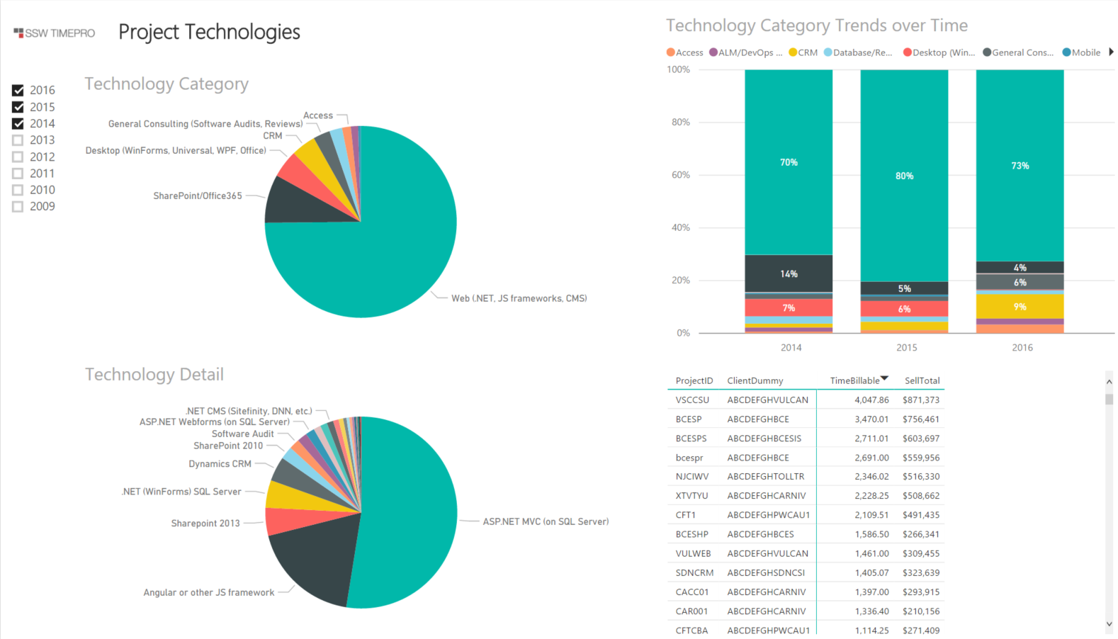
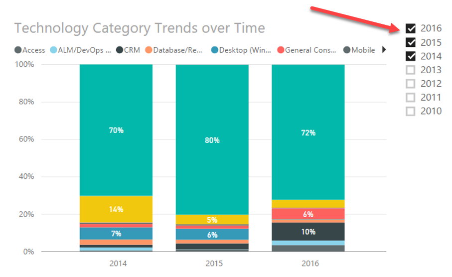
SharePoint was once 70% of our revenue. Let’s look at the first pie chart to see where it is now.
Instant filter
Next, instant filter is awesome! It is invaluable to be able to click on one area of interest and has the other visualisations instantly filter down to just the relevant data.
Drilldown
It’s so neat how I can right-click then drill down further if there’s a hierarchy set up (e.g. year | month | day), or else view the underlying record line items if needed.
Slicers
Slicers are a little like parameters in that they allow me to filter down even further if needed, and the visual nature of the reports means that important data jumps out at me by focusing on less data.
Performance
In the past, SSW had OLAP cubes and they suffered 2 major problems. The 1st was performance, in that when you source stale data, you couldn’t just quickly get it refreshed, so you’re looking at stale data, which is annoying. The 2nd is that to develop OLAP cubes seems to take the developers forever, as in orders of magnitudes of time.
Power BI just works directly against your transactional database (by direct queries), and if you don’t want to hammer your database, you can specify to use a cache. In the old days, only a person with SQL Management Studio could rerun SSIS packages but now a power user can go to the data source and right-click and choose “refresh”.

Seeing Uly become curious
One of the best things was seeing how my non-technical Account Managers have been using it, especially my General Manager, Ulysses. He has gotten very excited about this and has developed a whole suite of new reports to better help me run the business. He’s looking at data I didn’t even know was that important.
The fact that Uly was able to create reports himself, rather than having to wait for a developer to get round to it, meant he became way more curious about our data than ever before. If he had a question, he quickly got an answer, and if this answer created more questions, he could continue to explore. Even better, he cleaned up a whole lot of my data.
These are just a few of the decisions that Uly pushed with Power BI reports:
- Google gives us more new opportunities than any other source, but it doesn’t give us high $$. Repeat business is where most of the large projects come from… so we know, when an existing client calls us, they’re much more important than a new lead.
- We’ve done work in Victoria for many years remotely. Uly was able to convince me to open a new office there (just like our Queensland office that has been going swimmingly for years) by using Opportunity data from CRM that showed it was even bigger than QLD. This is the reason we opened an office in Melbourne and hired a handful of great developers/coffee connoisseurs .
- We have seen an increase in Dynamics CRM work, so we trained up some of our .NET guys to become CRM gurus.
If you need any Power BI consulting, have a look at https://www.ssw.com.au/ssw/consulting/power-bi.aspx and give us a call.
To learn more about Power BI and how it can help your company, come along to the October Sydney .NET user group and see Ulysses Maclaren, SSW General Manager, and resident Power BI guru, present “Power BI – Finally I Can Make Decisions Based on Facts“. This event is live streamed.
Uly’s session has been and gone, but it was filmed so you can take a deeper dive into the exciting world of Power BI any time. Enjoy! 🙂
October 18, 2016 @ 7:24 PM
We’re looking for something similar to replace some cubes. Are you using Microsoft power bi cloud product or are you running it locally through ssrs?
October 19, 2016 @ 1:59 AM
Hi Greg,
At SSW, all new efforts have been focused on Power BI. We still have some reports and many legacy reports on SSRS (an on-premises SQL Server 2016 instance) but focusing all new efforts on cloud-based Power BI. All the cubes have been retired due to various issues, such as development time, slow iterations and stale data.
October 19, 2016 @ 2:13 AM
Thanks Nick, although I’m still not quite clear. Are you shipping all of your data (or at least the parts you want to query) into Microsoft’s Power BI cloud service? Or are you querying the data locally? I’m guessing if you’re sending it up to Microsoft then it’s either hourly or daily (based on their pricing page), but that seems to grate with Adam’s comment “The 1st was performance, in that when you source stale data, you couldn’t just quickly get it refreshed, so you’re looking at stale data, which is annoying.” Lots of days wouldn’t refresh quickly
October 19, 2016 @ 6:50 AM
Hi Greg,
> Are you shipping all of your data (or at least the parts you want to query) into Microsoft’s Power BI cloud service?
Yes
> “The 1st was performance, in that when you source stale data, you couldn’t just quickly get it refreshed, so you’re looking at stale data, which is annoying.”
There are two elements to the refresh – how long it actually takes, and who is confident and has the correct permissions to run the refresh. We have found that power users are much more confident in kicking off a Power BU refresh compared to refreshing an OLAP cube.
We haven’t found any significant performance issues in the refresh cycle.
Hope that answers the question.