German Cars and User Experience
Updated August 12, 2015: I bought a Tesla. It has the most enormous touchscreen – no irritating nobs to turn 🙂
G’day Developers!
For the last month I was driving through Germany, Italy, Austria and Croatia. I hired 3 different cars. Having mainly driven Toyotas, I was keen on experiencing some variety.
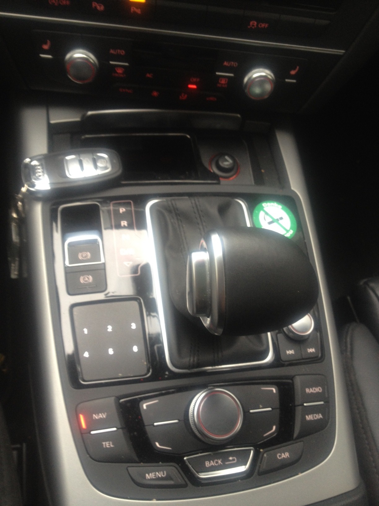
The 1st one was an Audi A6, it is beautiful piece of German engineering that I got up to 245km/hr without even feeling it. The only frustrating thing, was learning this iPod like wheel that you spin.
To work the dial/wheel you first rotate it, attempt to navigate up and down through menus, and press to select. You also have 4 buttons that surround the control which are very difficult to work out when all the instructions are in German.

I also used a Mercedes SLK200 which was almost as nice except it also had the dial/wheel to rotate and unfortunately a very small, iPhone sized navigation display.
The 3rd car I hired was a Kia only because my BMW fell through. The Kia unfortunately maxed out at 165km/h on the autobahn but I quickly understood what all the buttons did.

So which car did I like the most?
Surprisingly, it wasn’t the German engineering of the Audi or the Mercedes. It was the Kia. “Why?” I hear you ask. Because, the Kia was the only one with a large touchscreen which made using the GPS super easy 😀
It surprised me. Does it surprise you?
Cheers,
@AdamCogan
August 14, 2012 @ 12:06 AM
When living in Europe, I once had a 5am start where I had to pick up the Mercedes from work and drive it from Austria to Switzerland. The car was parked (in the snow) in the company carpark and all I had to do was reverse the car back and drive off.
Putting the car in reverse required lifting the knob before pulling it into the reverse gear. Took me nearly 45 minutes of trial error and reading the manual before I could depart!
It’s funny how users focus on small aspects of your product. Something that seems minor like an ipod like control wheel can make or break a design.
August 16, 2012 @ 1:24 PM
Hey Adam, great post. I’m definitely surprised too. I am currently driving south on Highway 1, California on a Ford Fusion. It doesn’t come with a built-in touchscreen, but the driving experience is being great for a bigger 4 cylinder car.
September 26, 2012 @ 7:31 AM
As a European you’ll know what I’ll say here, but there is more to it.
The German engineers are actually the ones that did the most usability testing and guarantee you that you will have a safer driving experience. Most European cars (like the PSA group) have copied the dial-with-buttons interface because it allows the driver to operate those systems with a steady control. Personally, having owned an aftermarket GPS-system with a touch screen, I have never felt comfortable operating it whilst driving.
I’m sure it takes some getting used to, but once you have driven such a car for some weeks, you can easily operate any other car with those type of controls.
They key point is that they want you to keep your focus and position as a driver, not as trying to operate the car systems (ironically?). Same reason why these Europeans (Volvo, Mercedes, BMW, Audi, …) spend months trying to make the new intelligent systems in their cars (lane-departure warning, lane-change warning, car-distance warning, parking distance control) to be as undisruptive as possible. You want to be informed and be focused on the road. Not focused on some warning lights/messages.
As an example: my sister owns a Nissan Qashqai. It comes with a rear-view parking camera. But it does not beep when you get close to objects. So will you be parking your car, watching the outside of your car and switching back and forth to the camera view ? Or will you be watching the camera view only? Or would you rather be looking outside of your car and listen to the beeps as you get closer to objects you otherwise did not see.
November 3, 2012 @ 5:09 PM
Hey Adam. Interesting post. I would have to say my experience with the Audi was the same as yours, and I loved driving the car. My wife was with me when we first sat in the car to familiarize myself with the vehicle. I always take a moment to do this and tend to understand the technology and interface in anything much faster than my wife. However, as my wife and I begane to familiarize ourselves with the “iPod like wheel” she almost instantly knew what to do. I loved that. I, being the slow one this time, took a few extra seconds to settle into the interface panel – and ended up loving it. But the one memory that sticks with me most is how quickly my wife (much less technical) grasped the Audi controls and interface, almost as if she had been using it for weeks.
Cheers!
Mark
Tips for Tesla: How Tesla could make the Model S even more awesome
August 12, 2015 @ 9:30 AM
[…] car to have a touchscreen (but at 17 inches it’s certainly the biggest). It’s miles better than the dial wheel I’ve encountered in some German cars, which I can’t stand. The touchscreen is awesome. It’s is unique because it does more than play […]