Microsoft is onto something here
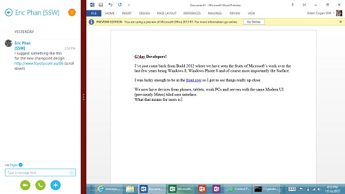
I’ve just come back from Build 2012 where we have seen the fruits of Microsoft’s work over the last few years being Windows 8, Windows Phone 8 and of course most importantly the Surface.
I was lucky enough to be in the front row so I got to see things up close.
We now have devices from phones, tablets, work PCs and servers all with the same Metro (dont tell me to call it Modern UI please) tiled user interface.
What that means for users is that they have the same *one* user experience.
What that means for developers is that we have the simplest way to build apps that go across these 3 devices.
I have been using the Surface RT for a number of weeks now.
First let me tell you about opening it. I got my 8 year old daughter (Ruby Cogan) to open it and she had herself up and running without any help. Within 7 minutes she was able to unbox it, connect to Wifi, find and install her first game without one word of guidance from me.
The only thing that took her a little bit of time to find was the search by swiping from the right (I do already love that every app has a consistent contextual search). It was only around half an hour before she was completely used to swiping up and down.
Ruby did not know about and therefore did not find the kickstand (although with the amount of advertising you are going to see, I doubt it will be a problem for you guys).
The thing that really excited her, which surprised me, was when she saw My Computer, she got excited “Wow!” and ran to get her USB to copy her sisters video to the desktop.
The Surface has been well received. There has only been one complaint mentioned and that was regarding the touch cover splitting on the corner for some users. I like the touch keyboard and the way it clicks in (although I am half expecting to start hearing a lot of problems with the hardware and those contacts not working reliably). I also love getting Alt+Tab functionality back.
I still want the built in mail client to be better, but it is great to finally be able to edit a Word, Excel or OneNote document.
I am amazed how good the split screen is so you can be reading email while continuing to watch that movie.
One thing developers need to be aware of when building apps, is to consider the size for the different resolutions in particular when an application is snapped. On the Surface, the snap view divides the screen up into ¼ and ¾, but this will be different on different devices (acutally the snap view is always 342 pixels) so you really need to get into responsive designing. For a good user experience, keep the left snap view for reading, not interactive stuff like filling in forms.
The great thing for developers, is the way you test. With Visual Studio 2012, the emulator simulates the Surface perfectly.
The brand new app store obviously has anorexia, but since it is the easiest platform to build apps for (significantly easier than building an iOS app, which has given us all fun and games for the last couple of years), that is not going to last long.
Now developers, you have 2 ways to write apps, XAML plus C# or HTML plus JavaScript (plus WinJS)(I’m not counting the other 2 ways which are XAML plus C++ or DirectX plus C++). Currently in our office, there is a slight lean towards XAML.
Cheers,
@AdamCogan
