The Microsoft Band 2’s UI vs. Fitbit
Let’s do an analysis of the UI differences between the FitBit and the Microsoft Band. Watch out, Microsoft… the FitBit user interface just got better.
I last blogged about the Microsoft Band 2 and my wishlist of 25 features. I’m pleased that the team has already fixed 3 features, leaving 22 remaining 🙂
Everyone in the Cogan household is continuing my social experiment and wearing both the Microsoft Band 2 and the Fitbit. The Microsoft Band is better in so many ways but the visual differences in the mobile app are its biggest weakness.
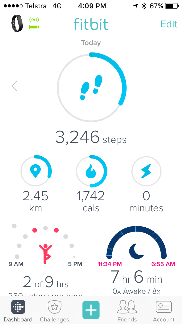
I see 6 pieces of information on the Fitbit
- 6 visualizations of data
- 6 numbers
Vs.
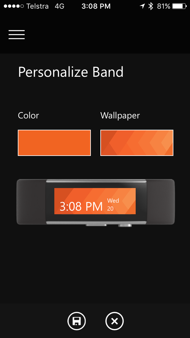
I see 3 pieces of information on the Microsoft band
- 0 visualizations
- 3 numbers
- Drag down to synchronize
- Syncing takes 5 seconds
- The ability to sync on multiple devices; in my case, both my iPhone and iPad
Vs.
- Can’t sync naturally on this screen
- Syncing takes 2 minutes and 5 seconds
- Can only sync on 1 device; in my case, my iPhone
Customizing on the Fitbit
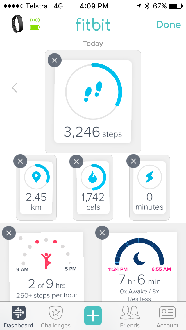
- Just press “Edit”
- UI shows the controls in the Edit view in the same place
- Easy-to-use iOS metaphor with shaking, dragging and “x” to delete
Vs.
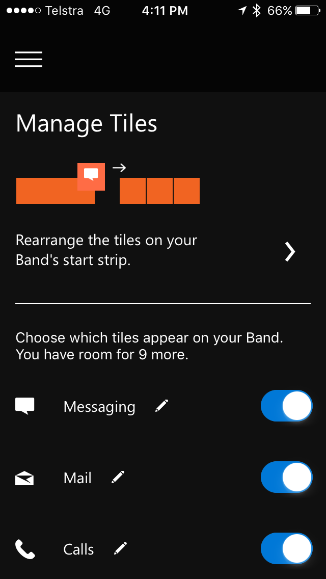
– A completely different Edit view
Also note: The normal UI’s 3rd menu is “Cals”, but on the customizing UI the 3rd menu is “Calls”… You can’t remove it 🙁
I’m loving the Microsoft Band 2. The updates so far have been improving the experience heaps. Let’s hope some UI improvements are coming.